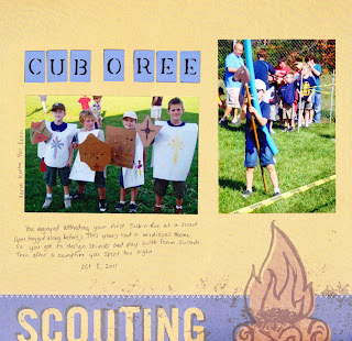
My current project, therefore, is getting that album caught up (at least until January 2012, since that's all I have photos printed for). So, with the exception of one "everyday" page I snuck in before I realized I needed to work on the Scout album, that's what all this batch of layouts is. One thing I like about doing the Scout pages, though, is that they go pretty quickly, and it doesn't matter if they all look the same. They are much easier to work with, too, because of the great Scout products K & Co puts out. Some of these pages are literally sticking the photos down and adding some journaling. I don't mind these types of pages, since I think I've said before that my scrapbooking is primarily for memory preservation, rather than artistic expression.
Caleb's Cub Scout album will end up being shorter than his brother's, though. He just crossed from Tiger Cubs to Bear, and will skip the Wolf year. He decided to do this since he is skipping second grade and going into third grade in the fall. He decided rather than staying with his den he started with, he would rather be with the rest of the third-graders. He knows most of them anyway, since he was in a second grade class with them part time most of the year. I'm glad he decided this way, since he will finally be able to identify with one grade (he split his time between two grades for the past two years).
Anyway....(sorry, I get a little sidetracked sometimes) here is a bunch of pages I've done over the past week or so. I know some of these are not much to look at, but my out of town family at least likes to see the photos.
Punch: Martha Stewart
Cricut Cartridges: Mickey Font, Lyrical Letters
On this page I used one of my favorite tricks. The green paper is actually from a mat stack, but by putting the white strip across the page, I could "stretch" it to fit the whole page.
Sketch: Amy Alvis
Papers: DCWV, K & Co
Cricut Cartridge: Lyrical Letters
Stickers: K & Co
I used my other favorite trick on this one. I only had one sheet of the yellow cardstock, so I cut it into 3" strips and stuck it to some patterned paper that I knew I'd never use. The other papers just went on top. That's another reason I love these sketches so much. Many of them you can get away with using small amounts of paper.
Sketch: Amy Alvis
Papers: DCWV
Stickers: K & Co
Cricut Cartridge: Alphalicious
I used the same trick on this one. I can use up ugly patterns and conserve my more precious solid cardstock (although a lot of the time I really only have one sheet of a color)!
Papers and stickers: K & Co
Cricut Cartridge: Lyrical Letters
Papers: DCWV, K & Co.
Stickers: K & Co
Punch: EK Success
All Supplies: K & Co
(This one goes into the "at least it's done" file)
Papers: DCWV, K &Co
Stickers: K & Co
Embossing folder: Cuttlebug
Another "It's done" page
Paper: K & Co
Cricut Cartridge: Doodle Type


No comments:
Post a Comment